With the ability to take a lot of guesswork out of conversion rate optimization, eye-tracking software and heat maps can reveal some startling insights into increasing conversions (and avoiding sales killers) that can benefit every business.
Here are 7 important eye-tracking studies that give a sneak peek into common browsing patterns and elements of human behavior that all marketers need to know.
1. Eye Tracking Shows We Must Avoid “Dead Weight” Visuals
You don’t have to be an expert in UX (user experience) to understand the importance of Fitts’s law.
While seemingly complicated at first glance, one of the fundamental lessons Fitts’s law communicates is that object “weight” (in the visual hierarchy) is a big determinant in what attracts eyes and mouse clicks.
Consider this recent case study from TechWyse that examined the homepage of a truck service with a heat map:
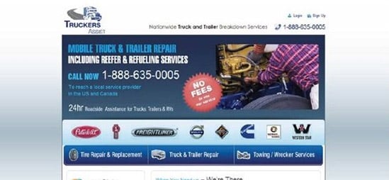
As you can see from the first test, the non-clickable “NO FEES” button was hogging a lot of attention, but it is not a call-to-action and its information isn’t the most important on the page.
That’s no good.
Also, it is right next to one of the most important CTAs on the page (the phone number) and it stands out so much that it actually is drawing people away from other more important elements.
Take a look at the changes they made to alleviate this problem.

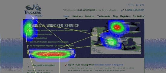
Much better!
The “Call Now” button clearly is getting a lot of attention over every other section on the page, which is great because it is how customers get started contacting the business!
Lesson learned: When you are assembling a persuasive landing page, be sure the elements that “pop” are the ones that matter, and that you aren’t giving too much weight to visuals that don’t encourage customers to take action.
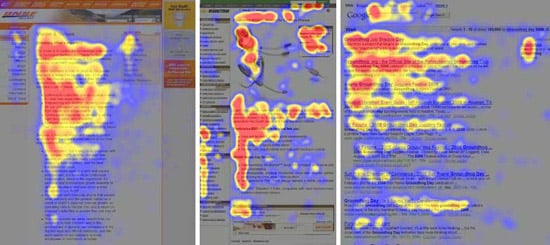
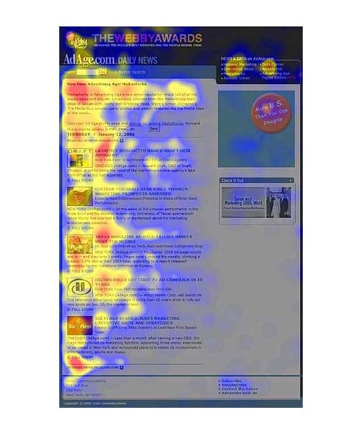
2. Eye Tracking Shows The Effect of Video on Search Results
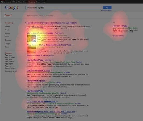
Most marketers have seen those SERP (search engine results page) heat maps that show the top 3 rankings hogging all of the action… But what role do visual elements play in holding visitor attention?
In an interesting heat map study published on Moz, videos were shown to be particularly powerful in capturing eyeballs through eye tracking, even when they weren’t the #1 result.
As you can see below, both direct video results (such as a hosted YouTube video) and embedded video results (videos embedded on a webpage) commanded more attention than a regular search listing, especially if they were near the top of the results.
Why video?
Video is usually is interpreted as a product video. However, instead of assuming, test to see if it impacts your search traffic for top keywords.
Lesson learned: If you want to stand out at the top of some competitive search results, you may want to test an embedded video rather than authorship for product pages.
3. The Power of Directional Cues’ Eye Tracking
Using visual cues to guide visitors to key areas of your site is nothing new, but just how effective is it?
According to studies such as the aptly named Eye Gaze Cannot be Ignored, it is incredibly effective. Human beings have a natural tendency to follow the gaze of others, and we have been coached since birth to follow arrows directing us to where we should be looking and going.
Consider the following eye tracking heat map example that included a page with a baby and a compelling headline for taking care of the baby’s skin.
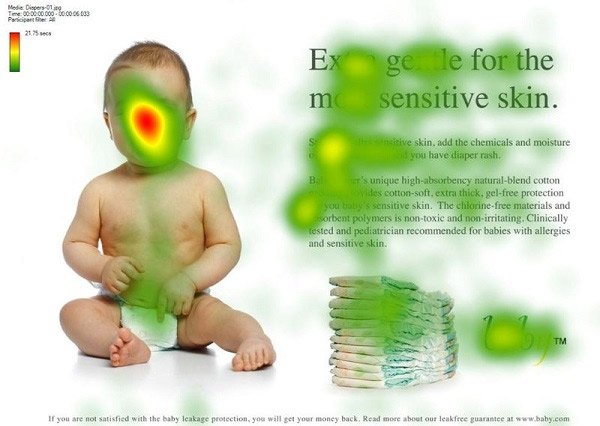
It’s obvious that the baby’s face is drawing a lot of attention. (As a matter of fact, faces of babies and pretty women draw the longest gazes from all visitors.)
Unfortunately, from a marketing standpoint, this is a problem because the copy isn’t commanding enough attention.
Now look at the browsing patterns when an image of the baby facing the text was used.
As you can see from the eye tracking heat map, users focused on the baby’s face again (from the side) and directly followed the baby’s line of sight to the headline and opening copy. Even the area of text that the baby’s chin was pointing to was read more!
Lesson learned: Visuals are an important part of a site’s overall design, but most pages can be optimized by including images that serve as visual cues for where visitors should look next.
4. Eye Tracking Studies Show The F-Pattern Works Across the Board
According to this study from the Nielsen Group, all across articles, e-commerce sites, and search engine results, people almost always browse in an F-shaped pattern that heavily favors the left side of the screen.
This coincides with additional research that shows people tend to view the left side of the screen overall far more than the right.
It is important to note all of these studies were conducted with English speaking (and reading) participants. The opposite was true for those users whose languages read from right to left.
Is it any wonder that some of the most tested websites in the world (like Amazon) have placed a clear priority on the left sides of their homepages?
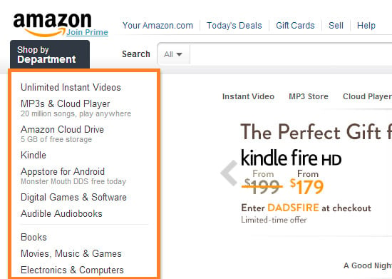
Lesson learned: Web users tend to browse sites based on their reading habits. For English speaking people (and languages with similar reading patterns), the left side of the screen is heavily favored, and all sites tend to be browsed in an F-pattern.
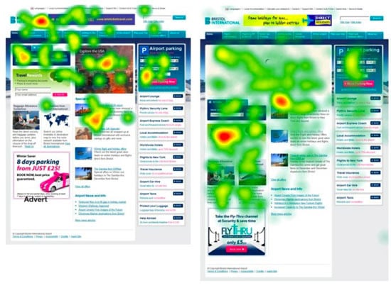
5. Eye Tracking Shows “The Fold” isn’t That Important
Relying on the screen above “the fold” to do all of the heavy lifting is one of the biggest usability mistakes you can make. The idea that it is the only place web users will browse is a complete myth.
Multiple tests (including this one and this other one) have shown that users have no problem scrolling down below the fold. Surprisingly, they will browse even further down if the length of the page is longer.
KISSmetrics conducted an interesting A/B test on his homepage and found that a page with 1,292 words beat a page with 488 words by 7.6%. And it didn’t end there. The leads from the long-form version of the page were higher in quality than the leads from the variation.
Another great test from the folks at ContentVerve showed that moving the call-to-action far below the fold actually boosted conversions by 304 percent.
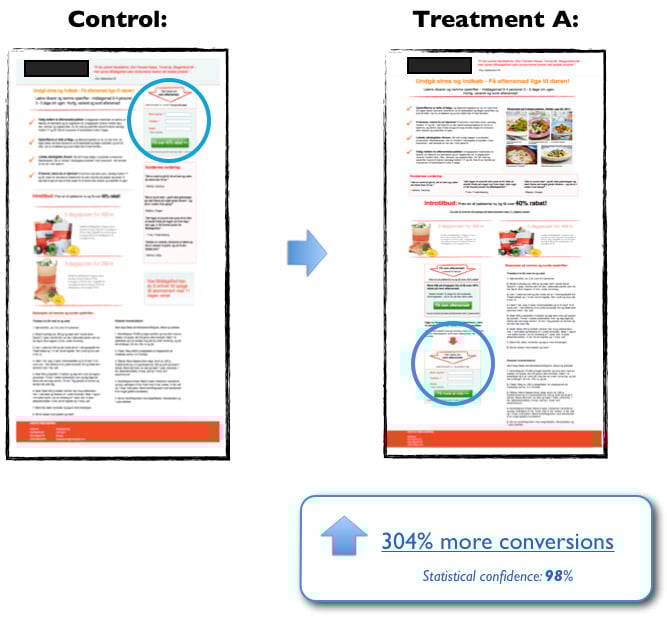
Lesson learned: Although it’s dependent on the page you are testing, you shouldn’t be afraid of placing important elements below the fold (and testing them there), because it gives people time to read your copy before they take action.
6. Eye Tracking Proves That Newsletters Should Be Short and Sweet
Who’d have thought that eye tracking and email marketing could be best of friends?
According to this eye tracking study conducted by the Nielsen Group, people scan emails very quickly, and the only areas they give any appreciable amount of time to at all are the initial copy and headlines.
From the study:
Users are extremely fast at both processing their inboxes and reading newsletters. The average time allocated to a newsletter after opening it was only 51 seconds.
This means that you need to get to the point in your emails in under a minute. The message should be as compelling as that of an online article, but you don’t have as much time to capture attention as you might in an article.
This coincides with a study from MarketingSherpa that shows people prefer short, clear, and un-creative headlines for their emails. (Creative headlines can seem mysterious, and mystery in an inbox may equal spam.)
Truly a situation where the KISS principle applies!
Lesson learned: Once you’ve earned the right to appear in a prospect’s inbox, be sure to keep that privilege by crafting emails that are clear and get to the point quickly. You don’t have as much time to broadcast your message as you would in an online article.
7. Eye Tracking Proves The Power of Pre-Sale Prices
If you’ve ever seen this video by Dan Ariely, you know that sometimes seemingly “useless” price points actually are quite important for increasing conversions.
One common pricing element that fits the bill here is the “pre-sale” price. It isn’t literally used by customers because they don’t pay that price… But is it still “used” to evaluate the new price?
In an effort to answer this question, Robert Stevens of THiNK Eye Tracking conducted a test that examined how people look at prices and products on shelves.
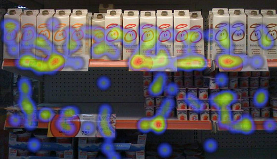
In the initial test, results weren’t too surprising. Most people spent time looking at prices and product packaging.
But if the pre-sale price was included, would people look at it?
They did!
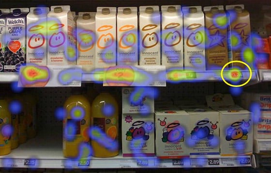
Better yet, Stevens also tested perception of the sale price to see if viewing the pre-sale price played a role.
These were his findings:
After consumers selected the smoothie of their choice, I asked them if their purchase was a good value for the money on a 7 point “like” scale (with 1 being very good value for the money and 7 being not very good value for the money).
Consumers who saw only the promotional item gave a mean score of 2.4. Consumers who saw the promotional item next to a full-price premium offer gave it 1.7, even though they purchased the same item!
Basically, humans are pretty bad at evaluating price without contextual clues (as argued by Ariely in this TED talk). We find it much easier to make decisions when we have something to base them on.
That’s why people often view a sale price as a better value when they can see what they really are saving. Without that contextual clue, the sale price is hard to evaluate because they don’t know what the product usually sells for.
Lesson learned: Sometimes “useless” prices like pre-sale prices can be used by customers to evaluate the value of a potential purchase.
About the Author: Gregory Ciotti is the marketing strategist for Help Scout, a Zendesk alternative made for small businesses that want help desk software with a personal touch. Get more data-driven content from Greg by downloading his free guide on converting more customers (with psychology).
The post 7 Marketing Lessons from Eye-Tracking Studies appeared first on Neil Patel.
